Responsive Is Beautiful
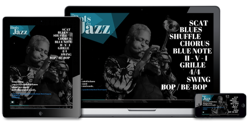
Whether your audience watches your story on a desktop computer, a tablet or a mobile phone, you can now manage the behaviour of your content so that it adapts perfectly to any screen size. Welcome to Klynt 2.11 new release!
By default, your project is rendered full window inside your browser, so anyone can enjoy a completely immersive and engaging storytelling experience.
Moreover, once published, your project can be embedded at a custom size fitting the format of the website it is displayed on.
Discover it now with the Pro version of Klynt (free update since the 2.10) as well as the demo version.
Last but not least, have a look at our brand new tutorial section, introducing relevant resources to guide you through the making of a Klynt project, from the very beginning to publishing your own project. New fresh tutorials will be published in the following weeks, so if you have any request or feedback, please let us know.