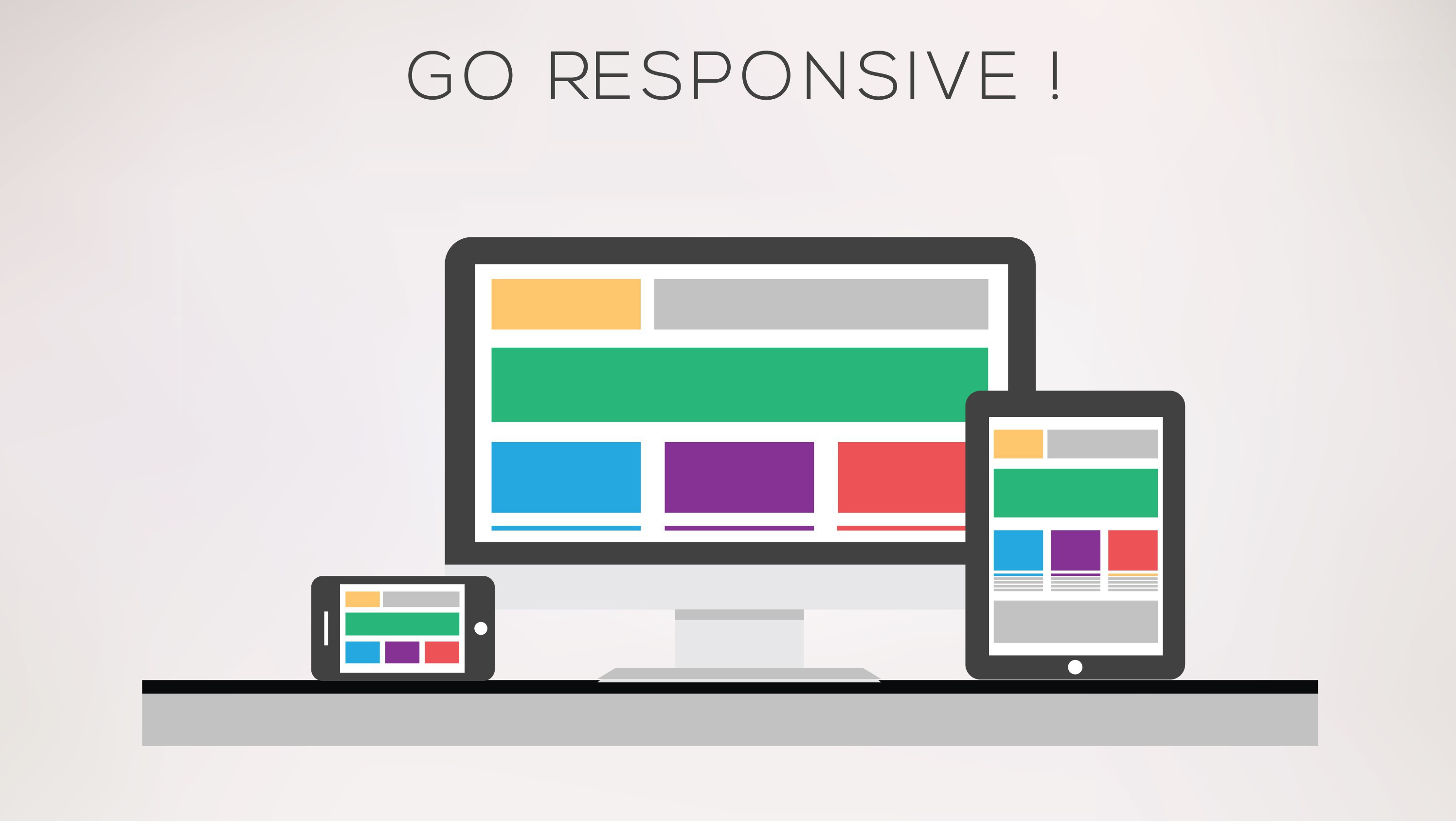
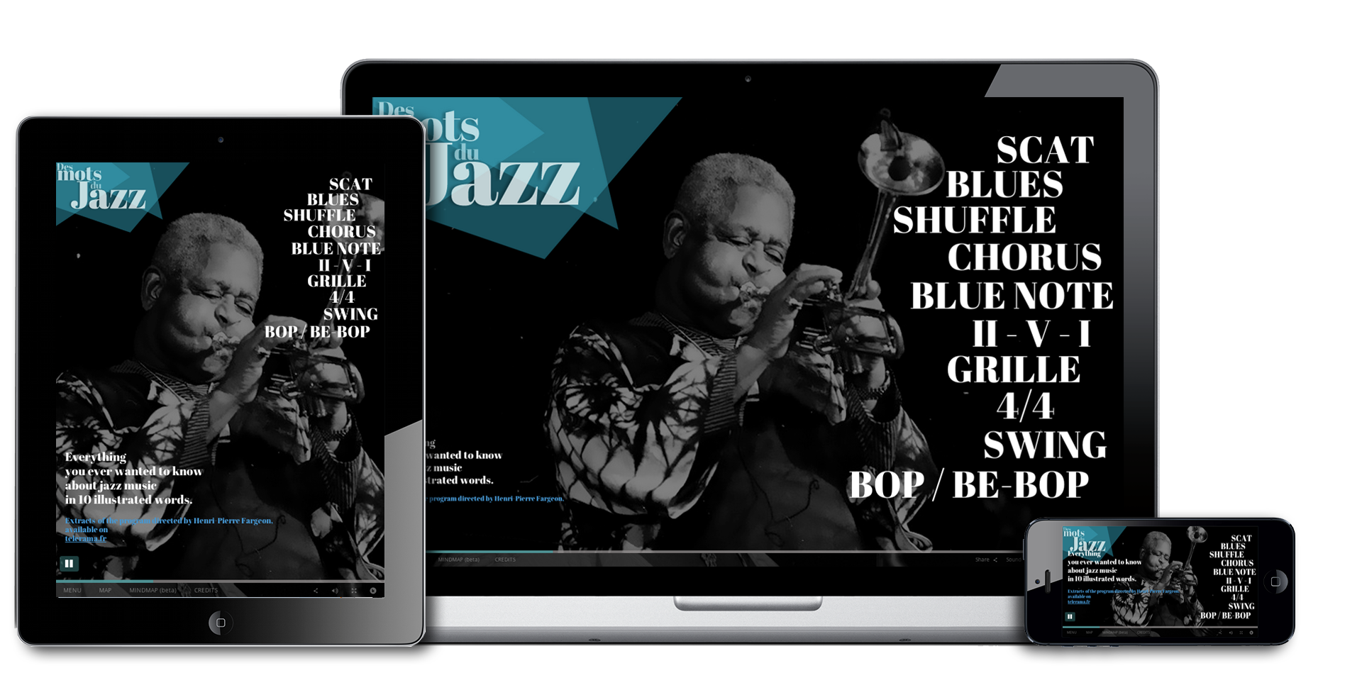
With Klynt 3, you can set new paramaters to create a fully responsive project, i.e., making sure it can be displayed well on both 27-inch screens as well as any mobile phones.
In this tutorial, I will explain how to use this new (advanced) feature using a simple example.
Tutorial Reviews
No Reviews found for this tutorial.